
Milan Liprt · Website & brand strategy

A website built around Milan and his way of teaching.

Milan helps anglers understand the water and make their own decisions. I worked on bringing that approach into his website, from the way his services are explained to the words, photographs and movement on the page.

Scroll
  • Project scope
  • Brand Direction
  • Website Strategy
  • UX/UI Design
  • Website Development
Client
Milan “Milda” Liprt, fishing mentor, Runaway Anglers Academy
My role
Brand strategy, web design and build, copywriting, art direction
Deliverables
Positioning and service structure, homepage, trip stories, contact page
Status
In progress, not live yet
Language
Czech

What the website needed to explain.

Milan’s work includes mentoring, fishing trips and an academy. The website needed to make those options easy to understand and help visitors decide where to start. It also needed to give people a feel for Milan himself, because spending time with him is a big part of the service.

Milan is my husband, so I’ve worked on his mentoring brand from the start.

01

Take a look through the website.

The homepage

Explore the page on desktop and mobile, with a few notes on why each section is there.

Keep scrolling to move through the page, or jump to a section below.

01 / 09 · Introduction“Naučím tě vodu číst.”
    02

    The decisions behind the website.

    Strategy

    The design grew out of a few decisions about how to introduce Milan and explain his work.

    Naučím tě vodu číst.
    Ne jen do ní nahazovat.

    The homepage headline: “I’ll teach you to read the water, not just cast into it.”

    a

    Put Milan at the centre.

    The needVisitors are choosing someone to learn from and spend time with.

    The decisionI made Milan the main point of introduction, with Runaway Anglers presented in relation to his work.

    b

    Make the services easier to compare.

    The needMentoring, trips and the academy have different purposes.

    The decisionI gave each a clear place on the page so visitors can see what it offers and explore the option that fits them.

    c

    Keep the language close to how he speaks.

    The needThe copy needed to explain his approach in straightforward Czech.

    The decisionI focused on what people will learn and experience, with room for Milan’s personality.

    03

    Colours and type.

    Visual language

    A dark green, a soft off-white and a warm ochre accent, used alongside Milan’s photographs.

    Forest green#1C2E24Dark sections and the fade below the opening photo
    Misty white#EBEBEFPage background
    Ochre#C59251Accent words, labels, buttons, lines
    Deep ochre#AE7D40Hover state of buttons and links
    Ink#111111Main text
    Grey#4A4A4ASecondary text
    Manrope + Lora Italic
    Naučím tě vodu číst.

    Manrope for headings and text. Lora Italic for a single accent word in a heading, and for the numbers in the facts strip.

    Logo
    ML monogram in ochre brush strokes

    Logo design: Vilém Jasný.

    04

    Movement that fits the setting.

    Animation & interaction

    The photographs already set the mood. I used subtle movement to carry that atmosphere through the page, while keeping the services and next steps easy to find.
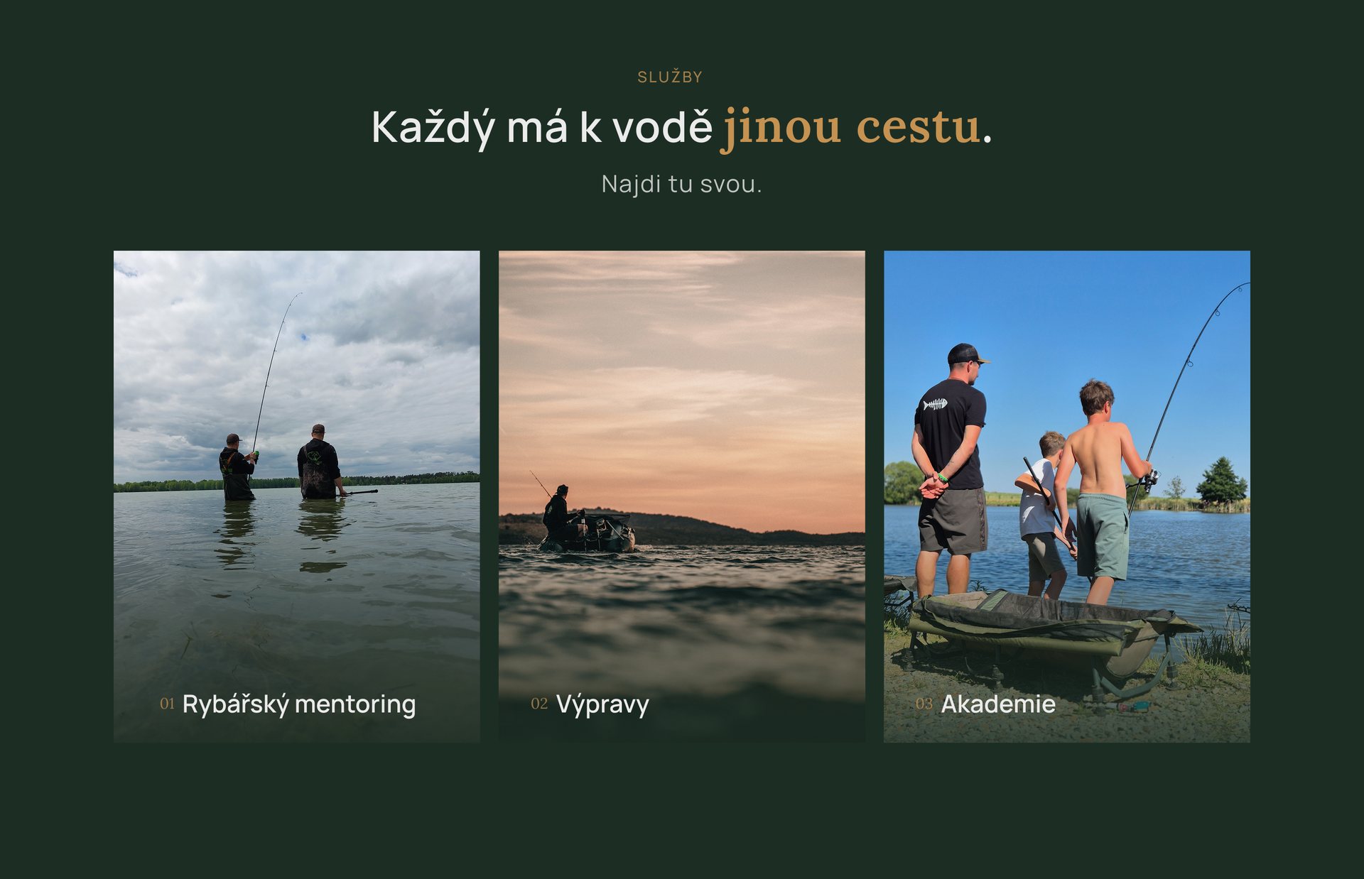
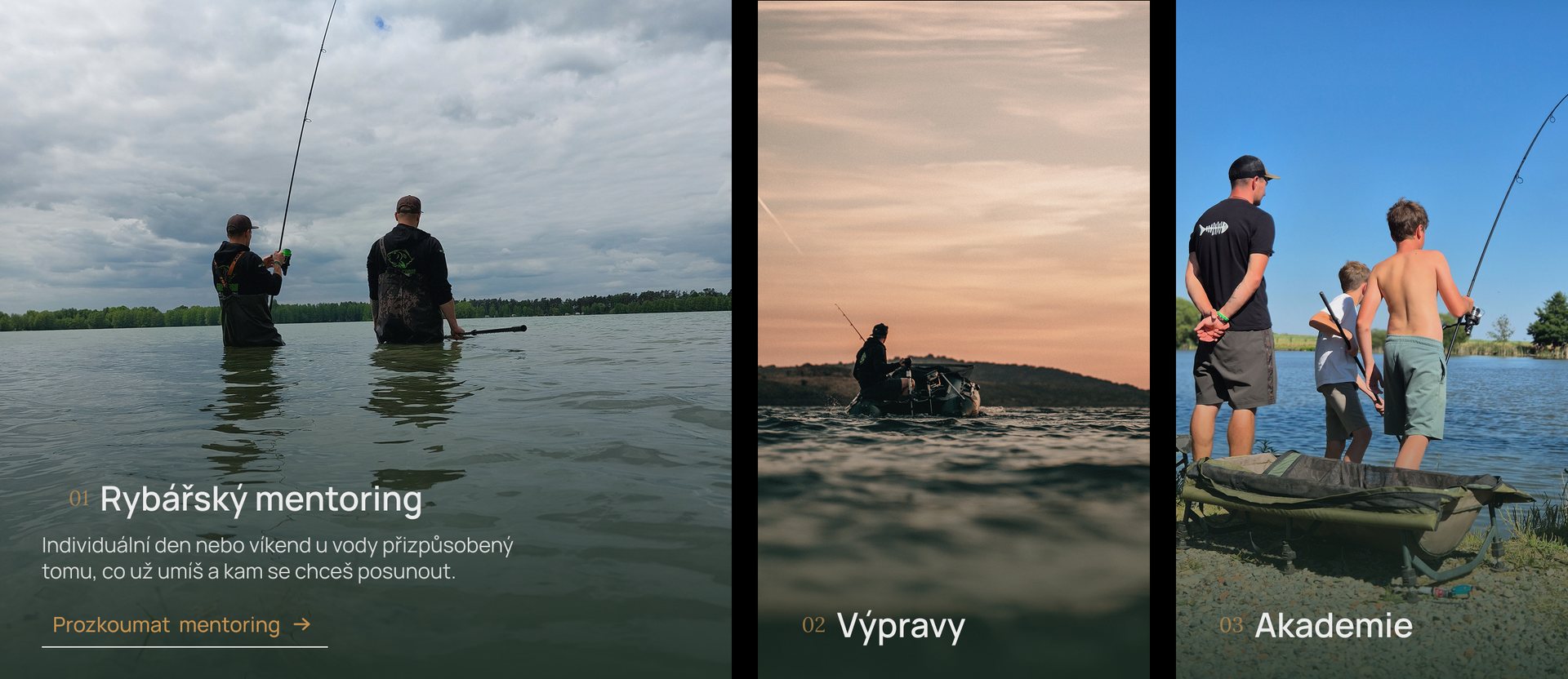
    Three service cards side by side: mentoring, trips and academy
    Service cards
    The mentoring card expanded with its description, the other two cards narrower
    Expanded card

    Gentle mist adds movement to the opening photograph.

    Service cards reveal more detail when you interact with them.

    Design & build notes
    MistTwo layers of the same looping video over the photo, blended with mix-blend-mode: screen. The back layer is mirrored and plays at 0.6× speed. As you scroll, the mist rises by up to 200 px and the headline lifts and fades.
    Service cardsOn desktop (1200 px and up), hovering or tabbing to a card widens it and zooms its photo to 1.05×. Below 1200 px, each card opens with a tap instead, so nothing depends on hover.
    Story cardsOn devices with a mouse, the card lifts 6 px and the photo zooms to 1.03×. The same happens on keyboard focus.
    TimingCard transitions use cubic-bezier(.22, .61, .36, 1) over 0.6 s.
    Reduced motionWhen the device asks for reduced motion, transitions are switched off and the mist video is paused. The video also pauses when the opening section is off screen.
    BreakpointsDesktop from 1200 px (designed at 1440 px), tablet 744–1199 px, mobile up to 743 px (designed at 390 px).
    ToolsFigma for the design. HTML, CSS and JavaScript for the build.
    05

    The same website, on a smaller screen.

    Tablet & mobile

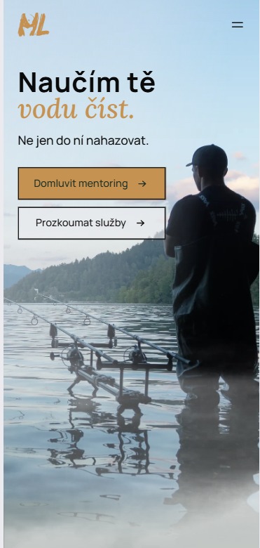
    On mobile, the content follows a single column, with the main services and contact options easy to reach.
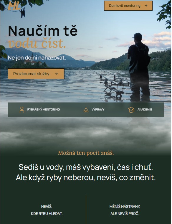
    The opening section on a tablet
    The opening section on a phone, with a different crop of the photo
    06

    From early layout to website.

    Process

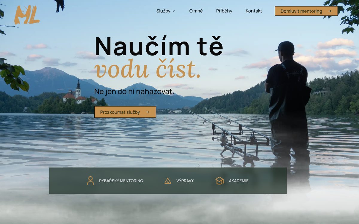
    In the current website, the headline sits on Milan’s photo from Lake Bled, with one button instead of two and a bar below it linking to his three services: mentoring, trips and academy.
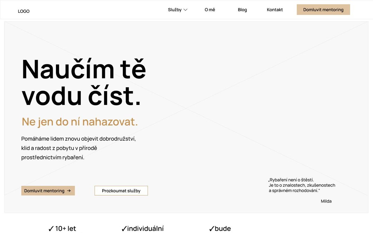
    Early layout of the opening section: the headline on a grey placeholder box, an intro paragraph, two buttons and a short quote
    Early layoutAn early layout exploring the content and page structure.
    Current opening section: the headline over Milan standing in Lake Bled, one button and a bar with mentoring, trips and academy
    Current websiteHow the layout developed into the current website.
    Explore both versions

    Each frame holds a whole page. Scroll inside it with your mouse, trackpad or finger, or select it and use the arrow keys.
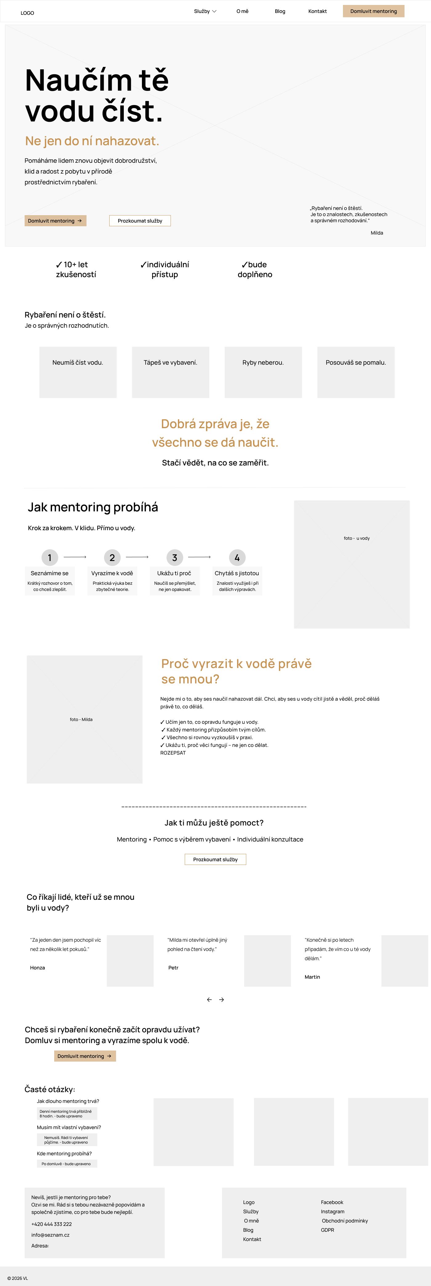

    The full early layout of the homepage with placeholder text and image boxes
    Early layoutFull page
    The full current homepage on desktop
    Current websiteFull page
    07

    What came together.

    Outcome

    A website that introduces Milan, explains his services and gives visitors a clear way to get in touch.

    Not live yet. The domain and launch are still to come.

    Done

    • Positioning and service structure
    • Homepage design, copy and build
    • Stories page with 15 trip and competition stories
    • Contact page with a form that preselects mentoring when you arrive from a mentoring button
    • Privacy page

    Planned

    • Mentoring, trips and academy pages
    • About page
    • Domain and launch
    From Milan’s review
    “What I value most is that she takes the time to understand my work and helps turn my ideas into something clear and practical.”
    Milan L., Fishing Mentor & Founder of Runaway Anglers Academy
    Strategy & copyVeronika Liprtova
    Design, build & art directionVeronika Liprtova
    LogoVilém Jasný
    PhotographyMilan Liprt, Vojtěch Bláha, Vojtěch Hodulák, Veronika Liprtova and friends

    Have a project in mind?

    Tell me a little about your business and what you’d like to work on. We can start there.

    ← Back to all work